


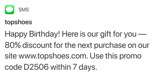


Stay in touch with your customers — wherever they are


Everything you need to streamline sales and marketing processes. From start to finish

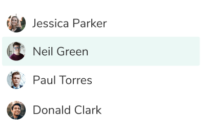
House all sales and marketing activities in one place
Get a complete picture of your contacts and workflows, collaborate seamlessly, and win more customers. All from a single, easy-to-manage dashboard.
Get full visibility
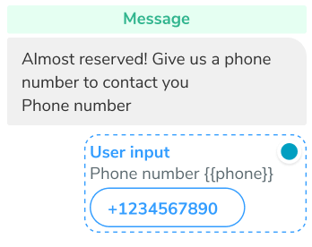
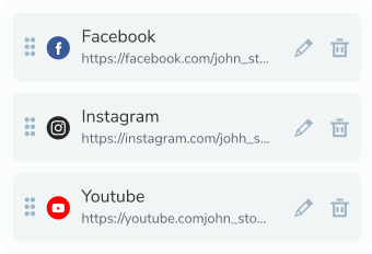
Use chatbots, subscription forms, and landing pages to capture contact details. Automatically push new contacts to your CRM and organize your existing contact data in lists and Kanban boards, so you can be sure that a lead never slips through the cracks again.
Fast-track communication
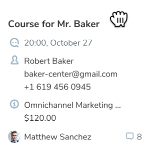
Integrate CRM with other SendPulse products seamlessly. Reach out to your leads and customers via email or chatbot directly from their contact card in your CRM.
Make data-driven decisions
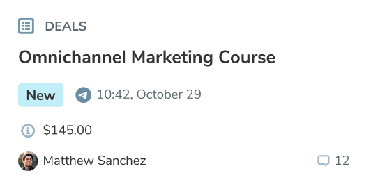
Have all of your customer interaction history and insights on hand to build winning sales pipelines and shorten sales cycles.
Improve collaboration
Bring all of your team members under one roof to eliminate organizational silos, assign roles and permissions, and keep track of sales and marketing processes.

Teach online and monetize your knowledge
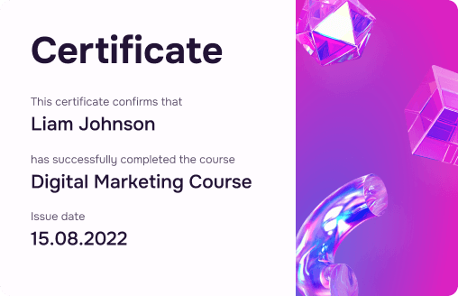
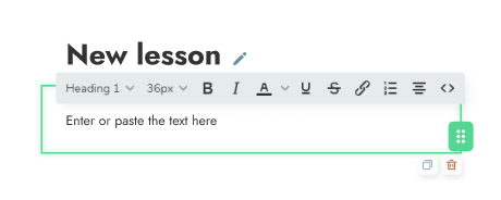
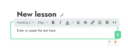
Create professional online courses using our simple visual builder, conduct tests, add homework assignments, and issue certificates of completion.
Enroll students in your course through an auto-generated landing page with the ability to accept online payments and promote your courses using SendPulse's tools.

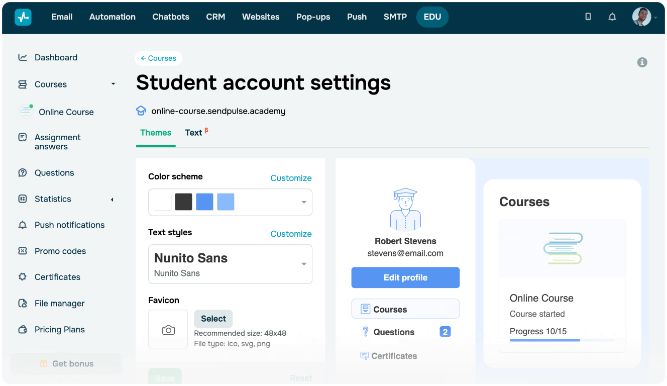
Instructor account
Set up your courses and their pricing, choose the format and order of your lessons, add teachers, and track students' engagement in the learning process.

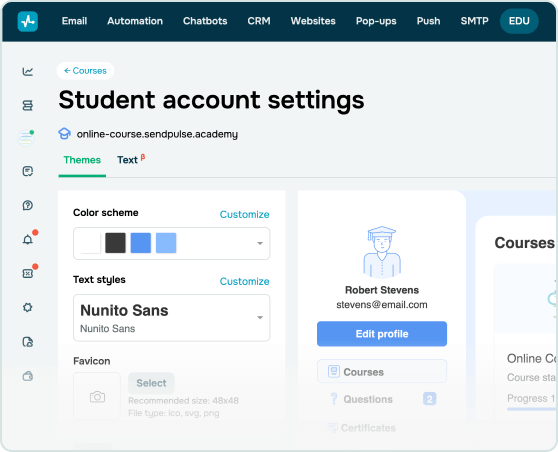
Student account
Pass the available courses, pay online through popular payment systems, communicate with teachers, and receive course completion certificates.
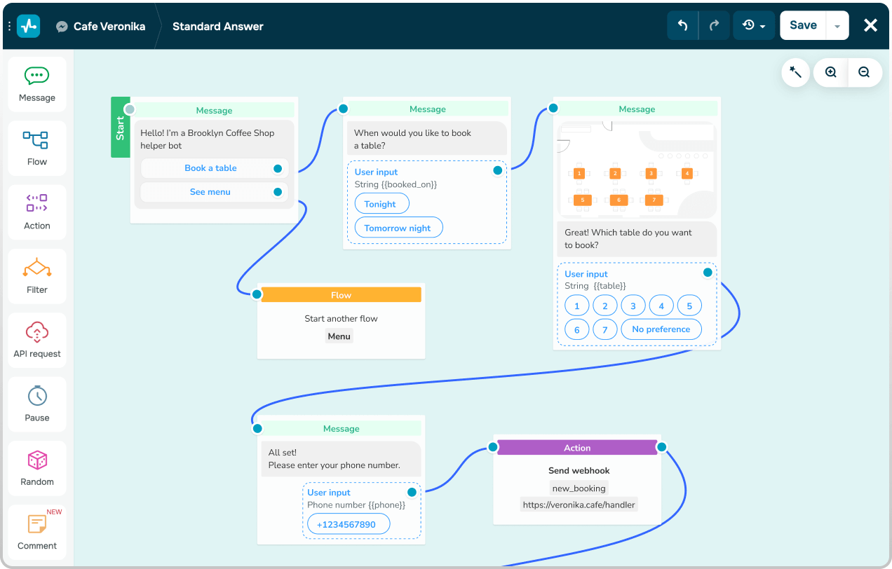
Take repetitive tasks off your to-do list
Use SendPulse automation features to keep time-wasting tasks on autopilot and get the time you need to focus on high-value work.
Enhance customer satisfaction
Make every customer feel special with personalized messages and lightning-fast responses

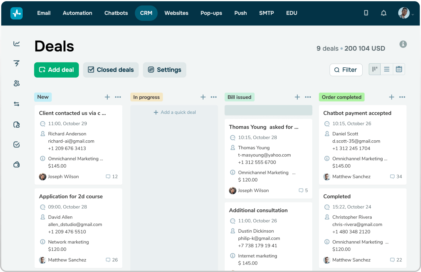
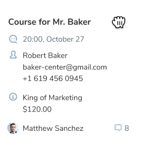
CRM
Analyze customer interactions throughout their journey and tailor your follow-ups to their behaviors and preferences.
Learn more →
Chatbots
Good customer service is fast customer service. Use messenger chatbots to speed up response times and never make a customer wait again – even outside of business hours.
Learn more →
Segmentation
Segment your contact list to deliver the right content to the right people at the right moments of their customer journey.
Learn more →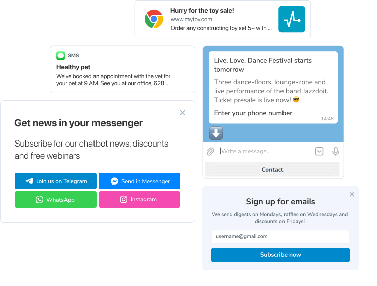
Turn prospects into paying customers
Get all of the tools you need to capture leads and map out the customer journey from awareness to sale.
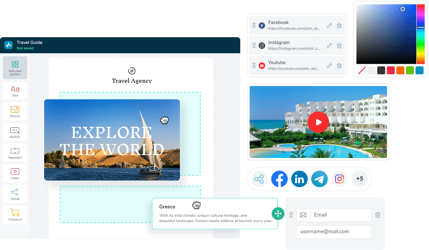
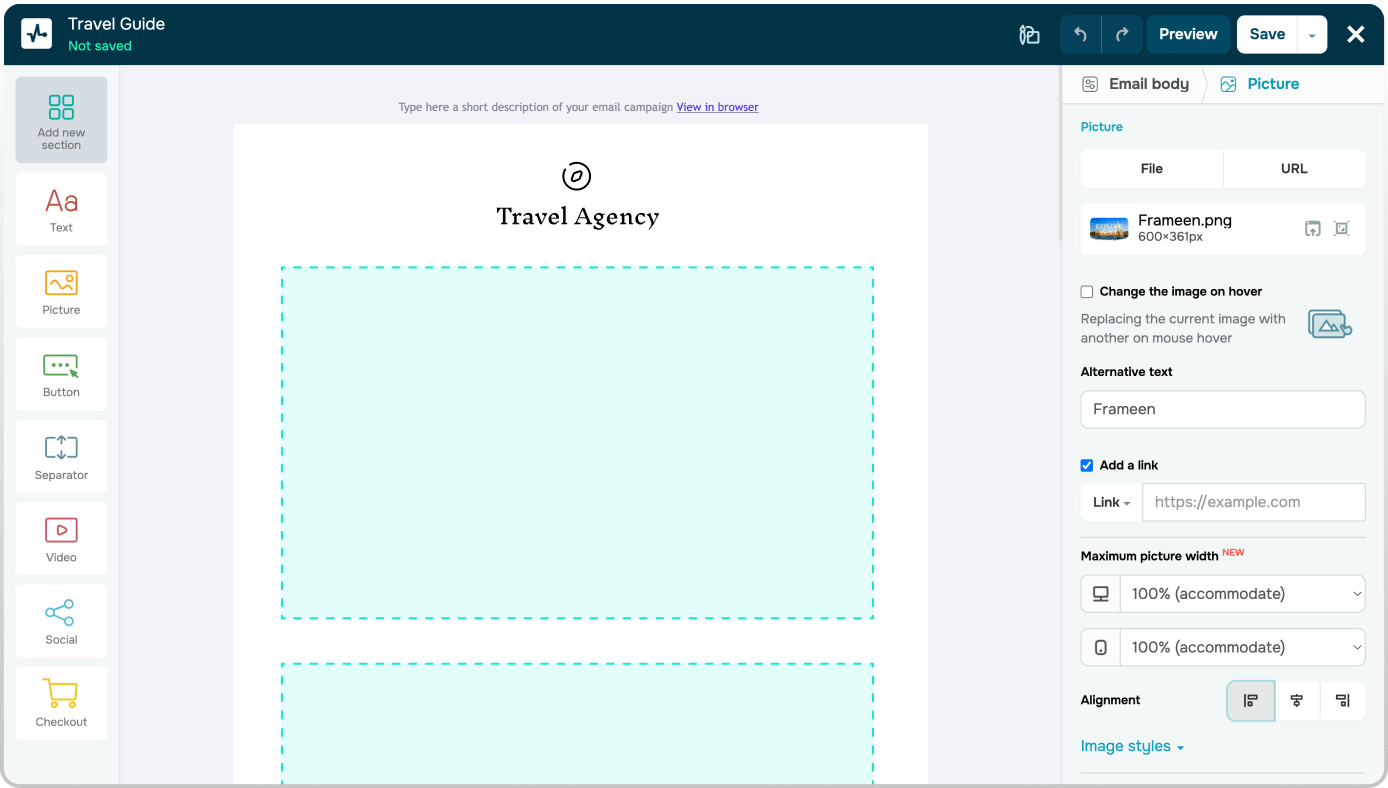
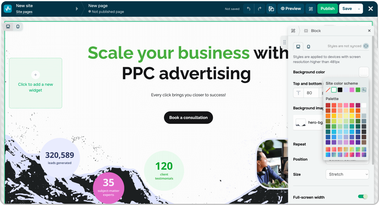
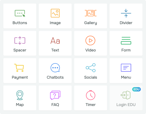
Make the creation process hassle-free
Use SendPulse creative tools and professionally designed templates to create compelling emails and powerful landing pages in a matter of minutes.
Stay on target with customer insights and campaign analytics
Take the guesswork out of your marketing and sales process with actionable insights to refine your strategy

Email campaign reports and analytics
Get detailed reports on your email campaigns. Tweak them for success and uncover hidden growth opportunities.
Learn more →
A/B testing
Identify what resonates with your audience and fine-tune your marketing and sales strategies.
Learn more →
CRM
Know what’s going on with every deal and never miss a step in your sales or marketing process.
Learn more →Integrate SendPulse features with your project
Automate data transfer, and send campaigns directly from your project. Check out the list of CRM, CMS, and eCommerce systems you can integrate with SendPulse.
More than 40 integrations API documentation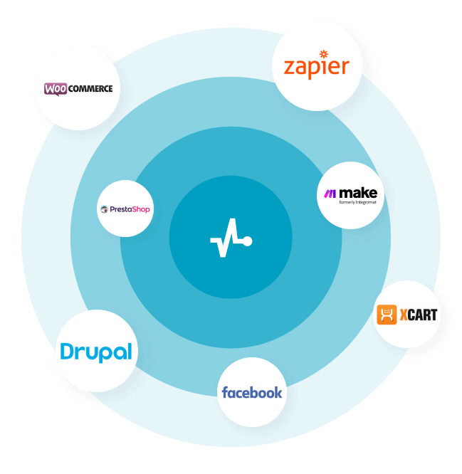
Get all of the help and resources you need, every step of the way
FAQ
What is marketing automation?
It is a set of tools that improve relationships with a massive audience. SendPulse is a marketing automation platform that offers triggered emails, chatbots, scheduled SMS, and web push notifications. Dive deeper into what marketing automation is.
Why should I use marketing automation?
Automated marketing makes your living easier since some of the crucial processes like purchasing, running giveaways, onboarding, and more can be once set up and run on their own.
How do I start using marketing automation?
Define the goals that marketing automation will help you achieve. Choose marketing channels respectively, mastering one channel after another. Here is the list of features SendPulse provides for your marketing automation.
How much does marketing automation cost?
The price depends on what tools you use, how many clients you have, and what features you need. Check out our pricing plans to find out what suits your needs.
or